The purpose of this website is to serve as a repository for websites that need to be re-designed and brought into this century. If you find yourself here, don't get mad... get even. FIX IT!!

Sunday, December 15, 2013

The Butcher's Strife

Welcome back folks. This week we have a very special guest! His name is David Farr. Mr. Farr's site is our point of interest this time around because not only is he a magician but he also markets his "Internet Marketing System" to magicians all around the country for ass loads of money.

This website suffers from many of the previously mentioned infractions from other websites. The one thing that baffles us the most here is the fact he has modern social media stuff on such a retroactively bad website. Marketing is all about image and the image this website represents is "I am too cheap to have a professional site made". Mercifully the audio files do not automatically play BUT they are flash based so no one will ever hear them on an idevice. If you click on "results" (I can't link you because for some reason it never leaves the main URL) there is the random red line on the left side, an annoying pop window, and the ability to scroll down FOREVER! All of that aside there is more harm on this website than just the interface and layout.


I am reminded of an analogy (heh anal) of how you should think of teachers and gurus in our community. If you want meat you go to a butcher. If you want internet marketing systems why not look for someone who is doing it right and doing what you want to be doing. If what you want to be doing is have a website that looks like it was made in a junior high school's web building class the "Amazing System" is right up your alley.

For a very large sum of money Mr. Farr will make you a site that sends people poorly written email templates. Then, on the off chance they happen to book you, it sends them a thousand more fucking emails which I am sure is just what they wanted. You're not "too busy" to talk to a client, don't kid yourself. Keep in mind also that the price of this "system" isn't actually a one time deal. There is another monthly fee that brings it to $300 a year on top of the initial 3 grand just to keep skull fucking your clients with emails.

To be completely honest Mr. Farr is one of the biggest scam artists in magic today. If you think that the "Amazing System" will help you make you one dick shake of money you are poorly mistaken. Spamming people won't make them book you. It will just piss them off, and then you're out a lot of money. My best advice is get a good act first, the money will follow. Don't just go buy an off the shelf kids show and think that David Farr and Brad Ross will make you superstars. Think about what their motivation is to give up all their "secrets" to marketing. Look at their careers and ask yourself if it's what you want to be doing, because they aren't performing magic, that's for sure.

UPDATE: It appears he too has decided to join the rest of the world with a better website. We can't speak for his business practices but at least the website is better. (However the layout could use some work) If you want to see what it USED to look like, Click Here.

Sunday, June 16, 2013

SEO magic?

If you are a magician then you are familiar with SEO. I of course mean the magic company. Outside of that most performers are clueless about SEO. It stands for Search Engine Optimization. THAT means your website appears higher up on a cursory search engine query. Being on page one is optimal. Showing up in the first slot is gold. Many web people will tell you that SEO is so important that you should spend tons of money to get yourself up the ranks. Let me save you some bucks.

Right now Google is using YouTube videos as top rankings for searches so having a YT video embedded on your front page can help loads to appear up top. Search engines love text. They even love text you can't see. A lot of people think a blog will help them because it has searchable text. While that is mostly true you can also do things like add proper alt attributes to your images. Instead of using an image for cool looking fonts check out Google Fonts. You can embed a zany font for your name or logo that is searchable.

One last bit o' honey is the more people who visit your site the more rank you are... er... the better you rank. So link your website to EVERYTHING. If you are on any forums, magic or not, make sure that website is in your signature. Put it at the bottom of every  email you send out. Anywhere you have the option, whore that sucker out!

If you are a generic birthday party magician in your town, then SEO might be more important for you than someone who does something more unique. Just remember, you are not a corporation that is in a constant struggle for product placement. There is no need to blow your bank account on some google rankings.

Saturday, June 15, 2013

Pretty sure this is 'shopped.

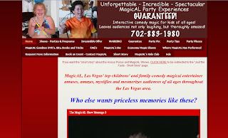
This website suffers from many of the aforementioned downfalls as the other but with the extra added bonus of having really bad photoshopping all over the website. If you scroll to the bottom of the main page you will see the magician doing an effect I am pretty sure he, nor anyone else in the world, does. I love how the color scheme just screams "fun kids magician". Blood red makes me think of a kids party every time. I also hate to say this but if I was him I would get some less fugly looking children better photos for the top of the website header. Hey magicians just remember: less is more.


UPDATE: Apparently this guy has packed up his props and gone back to his home planet. The website no longer works. HOWEVER, thanks to the magic of the internet we can go back in time to see what it used to look like.

Friday, June 14, 2013

Charlie, you can never come back...

The previous website was a victim of giant images that took forever to download and this one is no different. However, this one commits a few other crimes against web design I just had to share. One of which is the fact the logo does not link back to the main page. That feature has been a staple of websites since who knows when and I'd like to think most people know that is a common function. 

I think my favorite part of the whole site is that when you click on the calendar you have NO way to return to any of the other pages (unless you use the back button which is kind of crap to have to do).


Thursday, June 13, 2013

Hang Time

Have you ever been on a website that has a small photo that takes forever to load even on a high speed connection? If not go to this site and experience the fun for yourself!


The reason for this strange occurence is simple. It's when someone takes a 400kb photo that measures about 1,500px × 1,000px and then tries to shrink it down to 138px × 92px. For those of you not fluent in lonely geek speak that is ridiculously HUGE. It's like trying to squeeze 10 pounds of suck in a 5 pound bag. The whole site is littered with this faux pas. The only one that seemingly escaped this fate was the main image that appears to have been taken by accident while trying on an outfit at a costume store.

Tuesday, June 11, 2013

Why So Serious?

Every so often it's always good to pull your head out of the sand to stop looking at cat photos on the internet and check out the current tech being used on websites. Why you ask? Simple. So you don't end up like this poor guy here:


If you look at the website on anything other than Internet Explorer you might be a bit confused as to why the main page navigation is in the far bottom left corner. Well it's because it's supposed to move and animate up into the far TOP left corner (leaving a HUGE sea of red that goes way too far off the page). The problem is whatever script he is using to make with the animation is no longer playing nice with any browser other than IE which makes it look really bad (Especially considering how many people no longer use IE).

Once you manage to get inside you can see this website was top notch at one point in it's life. However, time has caught up with it and things like pop up windows and strange native video players plague this place. What's really messed up is the guy who designed and maintains the site has updated his look, layout and technology but not this site. I'm guessing someone owes someone else an apology.

Monday, June 10, 2013

Website Killer

I honestly had to take a second look at this website because I thought it was a badly designed business website. Turns out I was kind of right. It was an honest mistake. All of the menu links on the left look like a checklist for something else. They don't highlight, animate or otherwise let you know they are anything other than text. The links that are obvious take you to other websites that navigate you AWAY from the main page. Hey guys, here is a little tip. Google target="_blank".


If you look at the bottom you can see the fine print. It says "Design downloaded from free website templates." Now look at the rest of the content. It's all marketing/success based stuff. (Even the magic tricks) I wouldn't trust this guy to manage my sock drawer let alone teach me how to market myself with a website like this. 

Saturday, June 8, 2013

The Miracles of Modern Technology

So this weekend's advice is a pretty easy thing to do.

Google "modern website design" (I already did it for you Here you lazy bastards) and you will see what you have missed in the last 15 years. If your website has shown up on this blog, or fear it will, you might want to study these findings. 

Due to mobile devices dominating the landscape in the last 5 years, website design has moved to a more minimalist aesthetic. Also with the leaps and bounds internet speeds have made, you can now have FULL images as backgrounds. It's no longer the land of dial-up or having your website come in under 30kb.

I have bashed templates on here, and for good reason, but with the rise of Wordpress as the soccor mom minivan of the website world most templates you will find on that platform reflect current web design trends. Does that mean if you know nothing about design you should tackle it yourself? HELL NO! It just means if you decide to do it your website will at the very least look better than what we have seen lo these past two weeks.

Back and to the left?

After a while you will notice some redundant themes on these websites I am posting. I am not going to keep harping on the lack of justified text (both in format and content), or the fact the pages seem to go on forever, nor clashing colors. You are likely smart enough to figure out those flaws for yourself. Instead I will attempt to only point out NEW flaws. Hence....


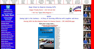
Now I could make some obvious jokes about the design of the website vs. Jeffo's lack of sight but I like to think I am above such things. However, I am guessing he paid for this (and if not he is but not in a monetary sense) and his bastard friends haven't had the heart to tell him how much it looks like the French flag. How could they not notice that everything is aligned to the left of the window? There is so much text that, once you get over the horrible color scheme, you can't really focus on what to look at first. The mobile site is SO much better. Aside from the fact it's not an affront to the eyes, it's short and to the point. Someone take pity of Jeffo please and tell him to burn his current website to the ground. 

Friday, June 7, 2013

Spotty to say the least.

I want you to take a deep breath, clear your mind and find your center tag. Now ERASE IT! Centering all of your text is done. Sorry I had to be the one to tell you but there was a memo and it's over. There was also a note about using tiled backgrounds with bright red text that clashes against it. You might want to have someone forward that to you.

There is a line that reads, "If there is a problem with this page please contact webmaster and include the URL of the page and the problem". What bothers me is NO ONE has ever found a problem with this website enough to tell them so and if someone did they must have ignored it.

Wednesday, June 5, 2013

Websites that bite...

You know what I love to see? Tables. I don't mean the coffee kind. I mean the kind that make me nostalgic for web design in 1998. So classic, so vintage. The solid color background. The video links that make you download to watch. So many feels man. My favorite part? The copyright date that shows it hasn't been touched since 2006. (Which makes the coming soon page look even worse.)


Tuesday, June 4, 2013

The cons of pros

Even people who are higher profile in the magic business are not safe from bad web design. I was shocked to see this website quite frankly. It looks like it was made sometime in the mid 90's and hasn't looked back since. If you are a fan of this man's work, please don't let his lack of a proper website fool you into thinking this is a good idea.

Here is a quick run down of some of his crimes against keeping up with the times:
  1. Splash Page
  2. Un-justified text that spans the entire length of the page
  3. Navigation menu at the bottom of the pages
  4. so... much.. scrolling...

Saturday, June 1, 2013

Weekend Delights

On the weekends I am going to post website related advice to those who might need it.

To start with I am going to talk about the scam artists. I don't mean the guys who throw 3 card monte in New Orleans. I mean the unscrupulous &%$# who charge people huge amounts of cash to "design" a website only to fill in a Wordpress template or just some stock template they always use.

You will see the phrase "You get what you pay for" a lot on this blog. Well if you were "fortunate" to stumble on This Website like these poor fools you might be uttering the previous line to yourself. Avoid places like this who are just trying to get your money. Spend a little more and get something unique and YOU.

(An interesting sidenote: A lot of the "Testimonials" they have received are from people who have since had their websites done by different companies in a slightly more modern style)

Friday, May 31, 2013

I'M BLIND!!

Well at least this guy has his own domain name but... but... the colors man.. the colors.

I've been wondering what young Brian Cox had been up to. Aside from the colors doing something unnatural to each other on that page it is LOADED with excessive text. Let me teach you a new term kiddies: Black Hat SEO. Cramming your website full of keywords no longer works. Google is smarter than you and has likely blacklisted this site so NO ONE will ever see it... which might the best thing Google has ever done for the world.

Thursday, May 30, 2013

The swelling has gone down...

Remember the last post where I mentioned how a free website looks bad for business? This one takes some if not all of the cake. (Click the image to see what I mean.) Back in 1832 domain names were expensive but now they are under ten dollars easy. There is no excuse for NOT having a proper domain name as a "professional". 

Also, if you have the time Google how to justify the text on your websites people. It's not like it's been the standard in print and layout since FOREVER! It's obviously not the website owner's fault tho'. After all he is obviously a gifted graphic designer and could not be responsible for this website layout abortion right?


Wednesday, May 29, 2013

Let freedom ring!

Nothing says "You get what you pay for" like a website url that contains "Webs, Wix, Weebly, etc" in it. For the love of all that is is full of holes, pony up some of that cash you get from those crappy birthday parties and get a website done right!

Into infinity AND BEYOND!

If it looks like your website was created in Front Page Express in 1998 it might be time to look into some modern web design. No one wants to scroll infinitely to find your pertinent information. NO.ONE.