
After a while you will notice some redundant themes on these websites I am posting. I am not going to keep harping on the lack of justified text (both in format and content), or the fact the pages seem to go on forever, nor clashing colors. You are likely smart enough to figure out those flaws for yourself. Instead I will attempt to only point out NEW flaws. Hence....
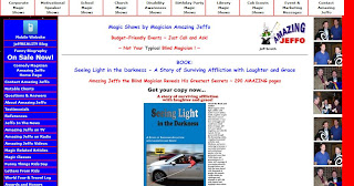
Now I could make some obvious jokes about the design of the website vs. Jeffo's lack of sight but I like to think I am above such things. However, I am guessing he paid for this (and if not he is but not in a monetary sense) and his bastard friends haven't had the heart to tell him how much it looks like the French flag. How could they not notice that everything is aligned to the left of the window? There is so much text that, once you get over the horrible color scheme, you can't really focus on what to look at first. The mobile site is SO much better. Aside from the fact it's not an affront to the eyes, it's short and to the point. Someone take pity of Jeffo please and tell him to burn his current website to the ground.
No comments:
Post a Comment
Vent your spleen!