The purpose of this website is to serve as a repository for websites that need to be re-designed and brought into this century. If you find yourself here, don't get mad... get even. FIX IT!!

Saturday, June 15, 2013

Pretty sure this is 'shopped.

This website suffers from many of the aforementioned downfalls as the other but with the extra added bonus of having really bad photoshopping all over the website. If you scroll to the bottom of the main page you will see the magician doing an effect I am pretty sure he, nor anyone else in the world, does. I love how the color scheme just screams "fun kids magician". Blood red makes me think of a kids party every time. I also hate to say this but if I was him I would get some less fugly looking children better photos for the top of the website header. Hey magicians just remember: less is more.



UPDATE: Apparently this guy has packed up his props and gone back to his home planet. The website no longer works. HOWEVER, thanks to the magic of the internet we can go back in time to see what it used to look like.

Friday, June 14, 2013

Charlie, you can never come back...

The previous website was a victim of giant images that took forever to download and this one is no different. However, this one commits a few other crimes against web design I just had to share. One of which is the fact the logo does not link back to the main page. That feature has been a staple of websites since who knows when and I'd like to think most people know that is a common function. 

I think my favorite part of the whole site is that when you click on the calendar you have NO way to return to any of the other pages (unless you use the back button which is kind of crap to have to do).


Thursday, June 13, 2013

Hang Time

Have you ever been on a website that has a small photo that takes forever to load even on a high speed connection? If not go to this site and experience the fun for yourself!


The reason for this strange occurence is simple. It's when someone takes a 400kb photo that measures about 1,500px × 1,000px and then tries to shrink it down to 138px × 92px. For those of you not fluent in lonely geek speak that is ridiculously HUGE. It's like trying to squeeze 10 pounds of suck in a 5 pound bag. The whole site is littered with this faux pas. The only one that seemingly escaped this fate was the main image that appears to have been taken by accident while trying on an outfit at a costume store.

Tuesday, June 11, 2013

Why So Serious?

Every so often it's always good to pull your head out of the sand to stop looking at cat photos on the internet and check out the current tech being used on websites. Why you ask? Simple. So you don't end up like this poor guy here:


If you look at the website on anything other than Internet Explorer you might be a bit confused as to why the main page navigation is in the far bottom left corner. Well it's because it's supposed to move and animate up into the far TOP left corner (leaving a HUGE sea of red that goes way too far off the page). The problem is whatever script he is using to make with the animation is no longer playing nice with any browser other than IE which makes it look really bad (Especially considering how many people no longer use IE).

Once you manage to get inside you can see this website was top notch at one point in it's life. However, time has caught up with it and things like pop up windows and strange native video players plague this place. What's really messed up is the guy who designed and maintains the site has updated his look, layout and technology but not this site. I'm guessing someone owes someone else an apology.

Monday, June 10, 2013

Website Killer

I honestly had to take a second look at this website because I thought it was a badly designed business website. Turns out I was kind of right. It was an honest mistake. All of the menu links on the left look like a checklist for something else. They don't highlight, animate or otherwise let you know they are anything other than text. The links that are obvious take you to other websites that navigate you AWAY from the main page. Hey guys, here is a little tip. Google target="_blank".


If you look at the bottom you can see the fine print. It says "Design downloaded from free website templates." Now look at the rest of the content. It's all marketing/success based stuff. (Even the magic tricks) I wouldn't trust this guy to manage my sock drawer let alone teach me how to market myself with a website like this. 

Saturday, June 8, 2013

The Miracles of Modern Technology

So this weekend's advice is a pretty easy thing to do.

Google "modern website design" (I already did it for you Here you lazy bastards) and you will see what you have missed in the last 15 years. If your website has shown up on this blog, or fear it will, you might want to study these findings. 

Due to mobile devices dominating the landscape in the last 5 years, website design has moved to a more minimalist aesthetic. Also with the leaps and bounds internet speeds have made, you can now have FULL images as backgrounds. It's no longer the land of dial-up or having your website come in under 30kb.

I have bashed templates on here, and for good reason, but with the rise of Wordpress as the soccor mom minivan of the website world most templates you will find on that platform reflect current web design trends. Does that mean if you know nothing about design you should tackle it yourself? HELL NO! It just means if you decide to do it your website will at the very least look better than what we have seen lo these past two weeks.

Back and to the left?

After a while you will notice some redundant themes on these websites I am posting. I am not going to keep harping on the lack of justified text (both in format and content), or the fact the pages seem to go on forever, nor clashing colors. You are likely smart enough to figure out those flaws for yourself. Instead I will attempt to only point out NEW flaws. Hence....


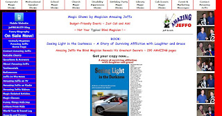
Now I could make some obvious jokes about the design of the website vs. Jeffo's lack of sight but I like to think I am above such things. However, I am guessing he paid for this (and if not he is but not in a monetary sense) and his bastard friends haven't had the heart to tell him how much it looks like the French flag. How could they not notice that everything is aligned to the left of the window? There is so much text that, once you get over the horrible color scheme, you can't really focus on what to look at first. The mobile site is SO much better. Aside from the fact it's not an affront to the eyes, it's short and to the point. Someone take pity of Jeffo please and tell him to burn his current website to the ground.