The purpose of this website is to serve as a repository for websites that need to be re-designed and brought into this century. If you find yourself here, don't get mad... get even. FIX IT!!
Showing posts with label justify. Show all posts

Saturday, June 8, 2013

Back and to the left?

After a while you will notice some redundant themes on these websites I am posting. I am not going to keep harping on the lack of justified text (both in format and content), or the fact the pages seem to go on forever, nor clashing colors. You are likely smart enough to figure out those flaws for yourself. Instead I will attempt to only point out NEW flaws. Hence....
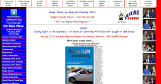

Now I could make some obvious jokes about the design of the website vs. Jeffo's lack of sight but I like to think I am above such things. However, I am guessing he paid for this (and if not he is but not in a monetary sense) and his bastard friends haven't had the heart to tell him how much it looks like the French flag. How could they not notice that everything is aligned to the left of the window? There is so much text that, once you get over the horrible color scheme, you can't really focus on what to look at first. The mobile site is SO much better. Aside from the fact it's not an affront to the eyes, it's short and to the point. Someone take pity of Jeffo please and tell him to burn his current website to the ground. 

Tuesday, June 4, 2013

The cons of pros

Even people who are higher profile in the magic business are not safe from bad web design. I was shocked to see this website quite frankly. It looks like it was made sometime in the mid 90's and hasn't looked back since. If you are a fan of this man's work, please don't let his lack of a proper website fool you into thinking this is a good idea.

Here is a quick run down of some of his crimes against keeping up with the times:
  1. Splash Page
  2. Un-justified text that spans the entire length of the page
  3. Navigation menu at the bottom of the pages
  4. so... much.. scrolling...

Thursday, May 30, 2013

The swelling has gone down...

Remember the last post where I mentioned how a free website looks bad for business? This one takes some if not all of the cake. (Click the image to see what I mean.) Back in 1832 domain names were expensive but now they are under ten dollars easy. There is no excuse for NOT having a proper domain name as a "professional". 

Also, if you have the time Google how to justify the text on your websites people. It's not like it's been the standard in print and layout since FOREVER! It's obviously not the website owner's fault tho'. After all he is obviously a gifted graphic designer and could not be responsible for this website layout abortion right?